Artboard: A Checkered Grid for HTML & CSS
Artboard is a simple way to add a checkered grid to an HTML element.
It’s based on this ingenious hack from user3061127 on Stack Overflow:
background-image:
  repeating-linear-gradient(
    0deg,
    transparent,
    transparent 70px,
    #CCC 70px,
    #CCC 71px
  ),
  repeating-linear-gradient(
    -90deg,
    transparent,
    transparent 70px,
    #CCC 70px,
    #CCC 71px
  );
background-size: 71px 71px;
This draws the grid with a one pixel repeating gradient; the main reason to create a package around this is to allow the size of the grid to be changed by just setting a Sass variable.
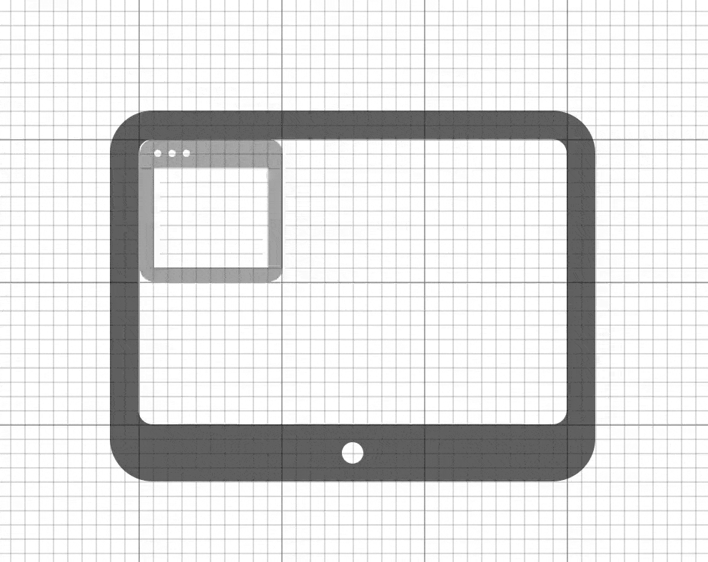
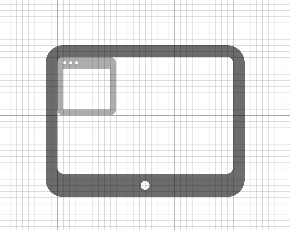
I’m fascinated by using grids for design. For layout, grids are already the industry-standard best practice1. But grids are also a valuable tool for icon design and illustration, take the Twitter and iCloud logos for example.
If an illustration is geometric, then it’s a good candidate for being represented programmatically. HTML, CSS and JavaScript are great solution for generating programmatic illustrations, especially given the flexibility of the <canvas> tag.
All of this is a roundabout way of describing why I was looking around for a way to create a checkered grid in HTML and CSS when I stumbled upon the aforementioned hack.
Why not just use a vector for this? One advantage of the programmatic HTML, CSS and JavaScript is that it allows animation logic to be scalable in the same way as graphics. Graphical assets and animations can be both be created based on the same grid values, then, when changing the size of the grid, the animation and assets will stay in proportion.